Operations, Streamlined
Categories
Rebranding, Web design
Client
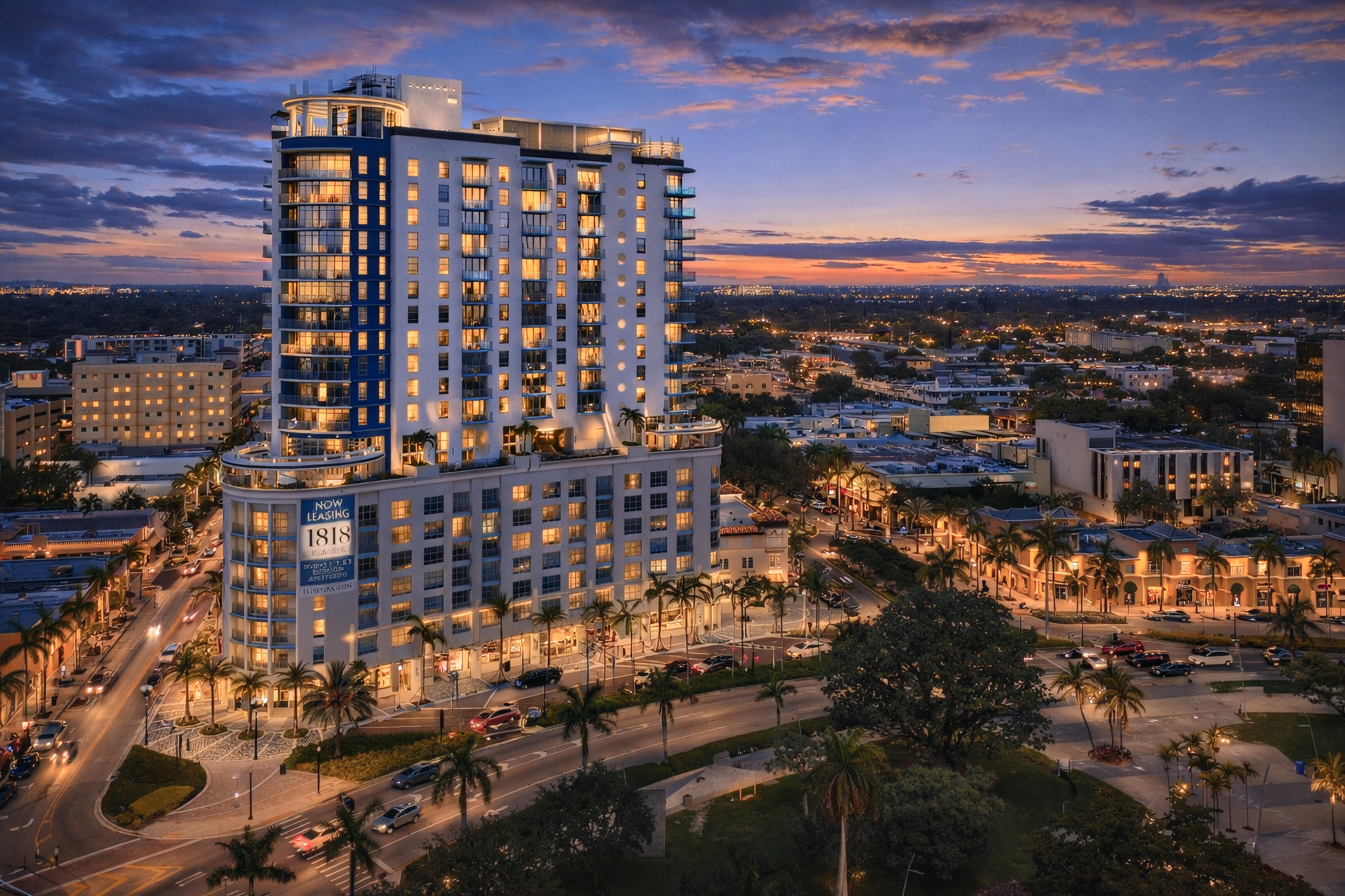
Palm Beach Hauling
Project
Take My Manure
Services
Branding Art & Design Direction Web design
Year
2025
Palm Beach Hauling was re-engineered from a utility brand into a performance-driven service platform.
Palm Beach Hauling was re-engineered from a utility brand into a performance-driven service platform.
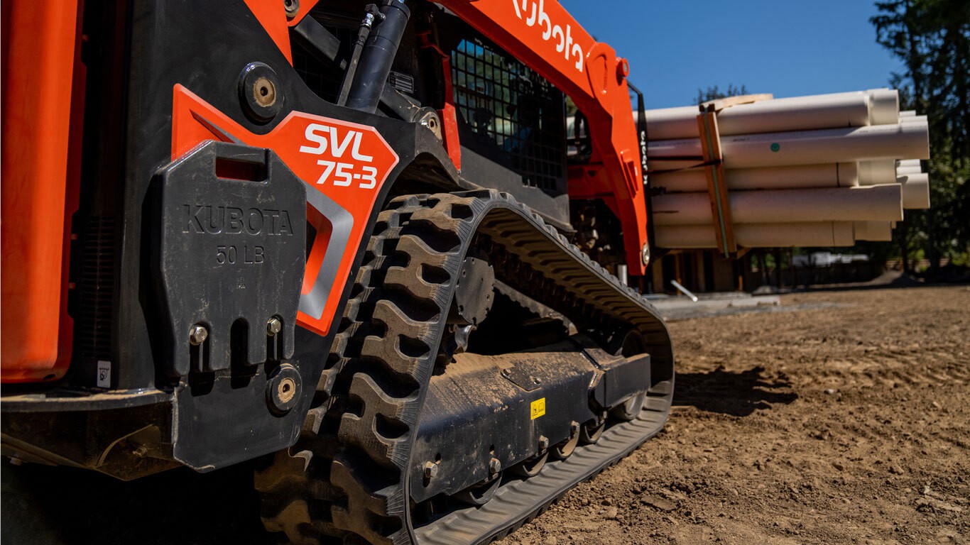

The objective wasn’t simply to modernize the logo or launch a new website—it was to create a brand infrastructure that could convert trust into action across every customer touchpoint. We rebuilt PBH as a digitally native operation, where identity, interface, and transaction flow operate as one continuous system. The refitted logomark and favicon established a sharp, recognizable signature that scales from truck decals to browser tabs, while the website was designed as a conversion engine—prioritizing clarity, speed, and decision-making at every step.
The objective wasn’t simply to modernize the logo or launch a new website—it was to create a brand infrastructure that could convert trust into action across every customer touchpoint. We rebuilt PBH as a digitally native operation, where identity, interface, and transaction flow operate as one continuous system. The refitted logomark and favicon established a sharp, recognizable signature that scales from truck decals to browser tabs, while the website was designed as a conversion engine—prioritizing clarity, speed, and decision-making at every step.

The service architecture was intentionally modular. Pricing tiers, scheduling logic, and service types were mapped as products inside a clean UI framework, allowing customers to self-select, book, and transact with minimal friction. Behind the scenes, the brand language was aligned to communicate reliability, professionalism, and operational discipline—elevating what is traditionally a blue-collar category into a premium, high-confidence experience.
The service architecture was intentionally modular. Pricing tiers, scheduling logic, and service types were mapped as products inside a clean UI framework, allowing customers to self-select, book, and transact with minimal friction. Behind the scenes, the brand language was aligned to communicate reliability, professionalism, and operational discipline—elevating what is traditionally a blue-collar category into a premium, high-confidence experience.
The service architecture was intentionally modular. Pricing tiers, scheduling logic, and service types were mapped as products inside a clean UI framework, allowing customers to self-select, book, and transact with minimal friction. Behind the scenes, the brand language was aligned to communicate reliability, professionalism, and operational discipline—elevating what is traditionally a blue-collar category into a premium, high-confidence experience.
The service architecture was intentionally modular. Pricing tiers, scheduling logic, and service types were mapped as products inside a clean UI framework, allowing customers to self-select, book, and transact with minimal friction. Behind the scenes, the brand language was aligned to communicate reliability, professionalism, and operational discipline—elevating what is traditionally a blue-collar category into a premium, high-confidence experience.